He empezado a usar Darktable y vaya joya. Es verdad que no es fácil y la curva de aprendizaje es pronunciada a tope pero una vez le echas ganas lo que te da es asombroso.
Ya poniéndonos cuqui he querido ver cómo era eso de customizar el CSS.
Encontré al bueno de Kranklin que pasa por aquí una hoja .css buenísima para copiar/pegar.
Yo buscaba el poder hacer que el fondo de mi cuarto oscuro fuese negro, tal que así:
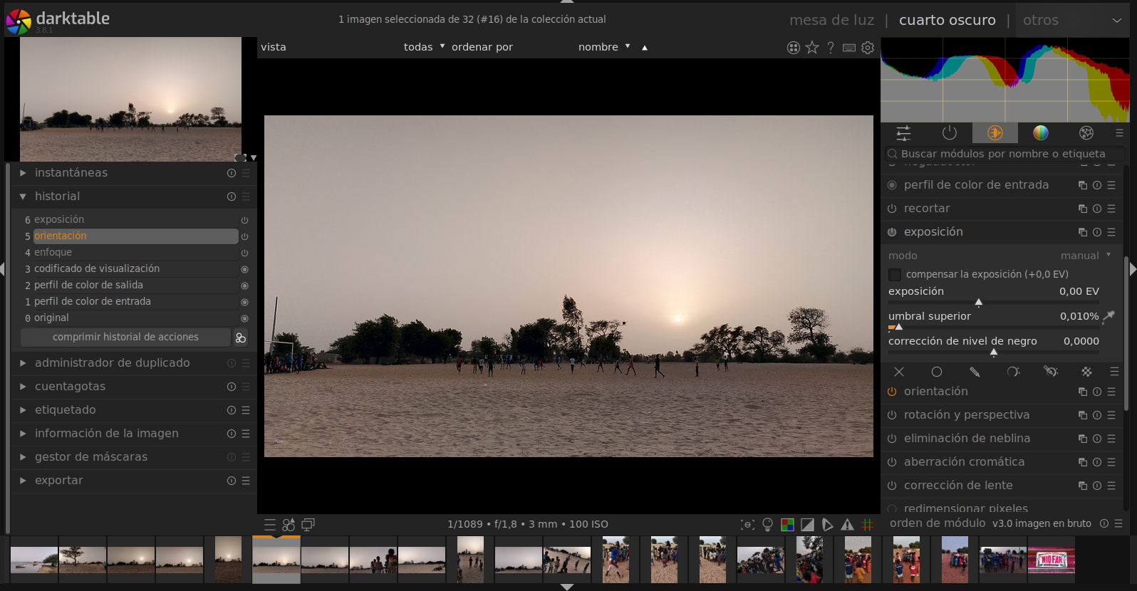
Con unos retoques aquí y allá, que si la typo más pequeña y otras florituras aquí te paso mi CSS por si te gusta cómo queda lo que ves en la imagen. Y si no, dale tu propio estilo y comparte 🙂
/* Incorpore las modificaciones al tema CSS aquí. */

/* other colors */
/* colletions tagging and styles background color in lighttable */
@define-color grey_01 #cccccc;
/* pure black */
@define-color grey_02 #000000;
/* tooltips background and history color in lighttable */
@define-color grey_05 #3c3c3c;
/* comboboxes border color */
@define-color grey_10 #141414;
/* general background */
@define-color grey_15 #232323;
/* modules parameters background */
@define-color grey_20 #2e2e2e;
/* background buttons*/
@define-color grey_25 #3f3f3f;
/* scopes guide lines */
@define-color grey_30 #695300;
/* UNDEFINED */
@define-color grey_35 #4c4c4c;
/* selection box in lighttable and scroll bars */
@define-color grey_40 #5e5e5e;
/* lighttable background and selections icons */
@define-color grey_45 #121212;
/* colorpicker middle grey */
@define-color grey_50 #777777;
/* unselected boxes in lighttable and filmstrip */
@define-color grey_52 #292929;
/* text boxes in lighttable and filmstrip */
@define-color grey_55 #505050;
/* text color modules in lighttable and darkroom COLOR TEXTOS MODULOS */
@define-color grey_60 #a1a1a1;
/* tooltips text color in lighttable */
@define-color grey_65 #9e9e9e;
/* text color buttons in lighttable and darkroom and content */
@define-color grey_70 #a2a2a2;
/* text color in module options and background in comboboxes */
@define-color grey_75 #9b9b9b;
/* middle gray background in darkroom and selecion boxes in lighttable */
@define-color grey_80 #808080;
/* text color parameters in modules in lighttable and darkroom */
@define-color grey_90 #d4d4d4;
/* icons color in modules */
@define-color grey_95 #f1f1f1;
/* pure white */
@define-color grey_100 #ffffff;
/* orange selections */
@define-color orange_00 #e08217;
/* blue color for sliders */
@define-color cyan_00 #1c71d8;
/* test color */
@define-color red_00 #c01c28;
/*--------------------------------------
  - Define default colors and settings -
  --------------------------------------*/
/* Scroll bars (sliders) */
@define-color scroll_bar_active @orange_00;
/* Modules box (plugins) */
@define-color plugin_bg_color @grey_20;
@define-color plugin_fg_color @grey_80;
@define-color section_label shade(@plugin_fg_color, 0.80);
@define-color plugin_label_color @grey_80;
/* Modules controls (sliders and comboboxes) */
@define-color bauhaus_bg @grey_15;
@define-color bauhaus_fg @grey_90;
@define-color bauhaus_fill @orange_00;
@define-color bauhaus_bg_hover @grey_95;
@define-color bauhaus_fg_selected @orange_00;
/* GTK Buttons and tabs */
@define-color button_border @grey_15;
@define-color button_fg @grey_01;
@define-color button_checked_bg @grey_40;
@define-color button_checked_fg @orange_00;
@define-color button_hover_bg @orange_00;
/* text fields */
@define-color field_selected_bg @grey_75;
@define-color field_selected_fg @grey_95;
@define-color field_hover_bg @orange_00;
@define-color field_hover_fg @grey_95;
@define-color field_selected_fg @grey_95;
/* Tooltips and contextual helpers */
@define-color tooltip_bg_color @grey_05;
/* Views */
@define-color lighttable_bg_color @grey_45;
@define-color darkroom_bg_color @grey_02;
/* Lighttable and film-strip */
@define-color thumbnail_font_color @grey_55;
@define-color thumbnail_bg_color @grey_52;
@define-color thumbnail_star_bg_color @orange_00;
@define-color thumbnail_star_hover_color @orange_00;
@define-color thumbnail_fg_color @orange_00;
@define-color thumbnail_selected_bg_color @grey_40;
@define-color thumbnail_hover_bg_color @grey_80;
@define-color filmstrip_bg_color @grey_45;
@define-color thumbnail_localcopy_color @orange_00;
/* Graphs : histogram, navigation thumbnail and some items on tone curve */
@define-color graph_bg @grey_02;
@define-color graph_border @grey_30;
@define-color graph_fg @grey_100;
@define-color graph_fg_active @orange_00;
@define-color graph_grid @grey_30;
@define-color graph_overlay @grey_10;
@define-color inset_histogram alpha(@grey_75, 0.50);
/* colors for histograms -- will be rendered in Rec.2020 linear */
 /* constraints:
    * graph_red, graph_green, graph_blue should be perceived as these primary colors
    * the sum of pairs of colors should be pereceived as secondary colors
    * the sum of all three colors should not have any channels exceed 100% and should appear white
 */
@define-color graph_red rgba(255,0,0 ,100);
@define-color graph_green rgba(0, 255, 0 ,100);
@define-color graph_blue rgba(0, 0, 255 ,100);
@define-color colorlabel_red rgb(255,0,0);
@define-color colorlabel_green rgb(0,255,0);
@define-color colorlabel_blue rgb(0,0,255);
@define-color colorlabel_yellow rgb(255,255,0);
@define-color colorlabel_purple rgb(255,0,255);
/* Reset GTK defaults - Otherwise dt inherits Adwaita default theme dark */
*
{
  background-color: @bg_color;
  background-image: none;
  color: @fg_color;
  font-size: 0.9em;
  font-family: sans-serif;
  text-shadow:none;
  box-shadow:none;
  padding: 0;
  margin: 0;
  border: 0;
  outline-style:none;
  min-width: 0;
  min-height: 0;
}
/* hide selection frame in culling */
@define-color culling_selected_border_color transparent;
/*----------------------
  - General properties -
  ----------------------*/
/* Sets outer borders that could be hide or shown in darktable with 'b' shortcut.
  remember, in gui/gtk.c, outer borders (active areas used to collapse panels)
  are defined to 5 px × DPI. We cheat by setting inner borders/spacing here to 5 px as well. */
#outer-border
{
  background-color: @border_color;
  min-width: 0px;
}
#resize-border
{
  background-color: #9b9b9b;
}
/* Default gtk buttons */
button,
#add-color-button
{
  font-family: sans-serif;
  color: @grey_95;
  border: 0.07em solid @grey_25;
  box-shadow: 0.8px 1px 0.8px @grey_15;
}
/* Set same settings on all those items */
button,
#add-color-button,
#dt-icon,
entry,
textview
{
  border-radius: 1em;
}
button,
#add-color-button,
combobox,
combobox button,
combobox *,
#iop-plugin-ui-main #control-button,
#lib-plugin-ui-main #control-button,
#header-toolbar #control-button
{
  min-height: 1em;
  min-width: 1em;
}
/* Default text fields and text boxes */
entry,
textview
{
  color: @field_fg;
  background-color: @field_bg;
  border: 0.035em solid @border_color;
  margin: 0.14em 0;
  font-family: sans;
  box-shadow: inset 1px 1px 3px @grey_10;
}
entry selection
{
  background-color: @field_selected_bg;
  box-shadow: inset 1px 1px 3px @grey_10;
}
/* Checkbox */
checkbutton check
{
  background-color: @bauhaus_bg;
  color: @bauhaus_fg;
  border: 0.07em solid @border_color;
  box-shadow: inset 1px 1px 3px @grey_10;
}
/* Labels in modules */
#iop-panel-label,
#lib-panel-label
{
  background-color: @bg_color;
  color: @grey_80;
  padding: 0 0.14em 0.14em 0.45em;
  font-weight: normal;
  font-family: sans-serif;
  font-size: 1.2em;
}
/* Progress bar on bottom left side when exporting, importing, etc... */
#background_job_eventbox /* background of export progress bar */
progressbar progress
{
  background-color: @orange_00;
  border-radius: 4px;
}
/* Set top margin on active image in filmstrip */
#thumbtable_filmstrip #thumb_main:active #thumb_back
{
  border-top: 0.3em solid @orange_00;
}
/* Set stars icon when active */
.dt_overlays_hover #thumb_main:hover #thumb_star:active,
.dt_overlays_hover_extended #thumb_main:hover #thumb_star:active,
.dt_overlays_always #thumb_star:active,
.dt_overlays_always_extended #thumb_star:active,
.dt_overlays_mixed #thumb_star:active,
.dt_overlays_hover_block #thumb_image:hover #thumb_star:active
{
  color: @orange_00;
  background-color: @orange_00;
  min-height: 1em;
}
/* Rating stars on left footer toolbar on lighttable view */
#lib-rating-stars
{
  min-height: 1em;
}
/*---------------
  - Other stuff -
  ---------------*/
/*** Some tags below inherit from properties above ; so avoid moving that part ***/
/* Progress bar on bottom left side when exporting, importing, etc... */
#background_job_eventbox /* background of export progress bar */
{
  background-color: @grey_15;
}
progressbar *
{
  background-color: @grey_15;
  border-radius: 0;
}
/* Color picker visibility for levels and rgb levels modules.
   be careful to not change that unless you really now what you do */
#picker-grey
{
  color: @grey_50;
  min-height: 1.3em;
  border: 0;
}
/*-----------------
  - Image options -
  -----------------*/
/* Set same settings on all those items */
button,
#add-color-button,
#dt-icon,
entry,
textview
{
  min-height: 1.5em;
  border-radius: 5px;
}
/*---------------------------------------
  - Context menu, tooltips & comboboxes -
  ---------------------------------------*/
/*** Basically everything that pops out/over on UI ***/
combobox,
combobox button
{
  border-radius: 0.14em;
  color: @bauhaus_fg;
}
/*--------------------------
  - GTK sliders and scales -
  --------------------------*/
/*** WARNING : sliders IN modules are bauhaus (from a custom lib in darktable), not standard GTK sliders (see below) ***/
#lib-plugin-ui scrollbar slider,
#iop-plugin-ui scrollbar slider,
scrollbar slider,
dialog scrollbar slider
{
  border: 0.5px solid transparent;
  min-width: 4px;
  min-height: 4px;
}
/*---------------------------------------------------------------
  - Set sidebars settings on preferences window and filechooser -
  ---------------------------------------------------------------*/
/* Set default sidebars settings */
filechooser .sidebar,
#preferences_box .sidebar scrolledwindow
{
  padding: 0px; /* needed to have an hover and selected effect on all width of categories in sidebar */
  font-size: 1.1em;
  background-color: @bg_color;
}
#preferences_box .sidebar row
{
  padding: 5px;
}
/* Set lines states */
filechooser .sidebar-icon,
filechooser .sidebar-label
{
  padding: 4px 6px 4px 10px;
}
filechooser .sidebar-button
{
  margin-right: 4px;
}
filechooser row
{
  margin-top: -4px; /* be sure to not have empty space on top of row for hover and selected effects */
}
filechooser .sidebar row:selected,
filechooser .sidebar row:selected:hover .sidebar-label,
#preferences_box .sidebar row:selected,
#preferences_box .sidebar row:selected:hover label
{
  color: @fg_color;
  background-color: @plugin_bg_color;
}
#preferences_box .sidebar row,
#preferences_box .sidebar row:selected
{
  border-left: 4px solid @plugin_bg_color; /* be sure border is set but not visible if category on sidebar not selected but keep same size and type for selected category ; color needs to be same as sidebar scrolledwindow background-color few lines above */
}
filechooser row:selected .sidebar-icon,  /* set icon instead of border for filechooser dialog window */
filechooser row:hover .sidebar-icon
{
  color: @button_hover_fg;
  background-color: @field_hover_bg;
}
#preferences_box .sidebar row:selected
{
  border-left-color: @field_hover_bg;   /* make the border left visible with choosed color if category on sidebar is selected */
}
filechooser row:hover,
#preferences_box .sidebar :hover  /* be sure border is set but same color as background-color hover effect and for same reason as just above */
{
  border-left-color: @button_hover_bg;
  background-color: @button_hover_bg;
}
#preferences_box .sidebar label
{
  padding: 2px 12px;
}
#preferences_box separator  /* reset border size to avoid having space between row in sidebar */
{
  border: 0px;
}
/* Gradient sliders */
.dt_gslider,
.dt_gslider_multivalue
{
  min-height: 2em;
  padding: 0.56em;
}
/* Set background color of overlays block infos */
.dt_overlays_hover_block #thumb_image:hover #thumb_zoom_label
{
  color: @bauhaus_fg_hover;
  background-color: rgba(255,20, 20, 0.5);
}
/*---------------------------------------
  - Context menu, tooltips & comboboxes -
  ---------------------------------------*/
context-menu,
menu,
menuitem > arrow,
tooltip,
popover,
combobox window,
dialog combobox window,
#bauhaus-combobox *,
#bauhaus-slider *
{
  border-radius: 0em;
  border: 0em solid @button_border;
}
/* Set red reject icon when visible */
.dt_overlays_hover #thumb_main:hover #thumb_reject:active,
.dt_overlays_hover_extended #thumb_main:hover #thumb_reject:active,
.dt_overlays_always #thumb_reject:active,
.dt_overlays_always #thumb_main:hover #thumb_reject:active,
.dt_overlays_always #thumb_main:selected #thumb_reject:active,
.dt_overlays_always_extended #thumb_reject:active,
.dt_overlays_always_extended #thumb_main:hover #thumb_reject:active,
.dt_overlays_always_extended #thumb_main:selected #thumb_reject:active,
.dt_overlays_mixed #thumb_reject:active,
.dt_overlays_mixed #thumb_main:hover #thumb_reject:active,
.dt_overlays_mixed #thumb_main:selected #thumb_reject:active,
.dt_overlays_hover_block #thumb_image:hover #thumb_reject:active
{
  color: rgb(255,255,255);
}
/* Set messages shown on bottom middle of the UI. For example "loading image..." or "working on..." */
#log-msg,
#toast-msg
{
  color: @orange_00;
  font-size: 1em;
  font-weight: bold;
  background-color: @grey_10;
  box-shadow: 2px 2px 2px 1px rgba(0, 0, 0, 0.2);
  padding: 0.56em 1.4em;
  border-radius: 0.56em;
}
 /* then set infos shown on top of the image on darkroom, like for example opacity in drawn masks */
#toast-msg
{
  color: @orange_00;
  font-size: 1.5em;
  font-weight: bold;
  background-color: @grey_15;
  box-shadow: 2px 2px 2px 1px rgba(0, 0, 0, 0.2);
  padding: 0.14em 1em 0.28em 1em;
  border-radius: 0 0 0.56em 0.56em;
}
/* Set rejected images */
.dt_thumbnail_rating_6 #thumb_image
{
  color: rgba(0,0,0,0.25); /* only the transparency is used to fade the image drawing */
}
.dt_thumbnail_rating_6 #thumb_back
{
  background-color: shade(@thumbnail_bg_color,0.65); /* also fade the thumb background */
}
/* LUA color menus */
button#sm_started label { color: rgb(255,255,255); }
button#sm_stopped label { color: rgb(105,105,105); }
/* Set where overlays block infos start on the image */
.dt_overlays_hover_block #thumb_bottom
{
  margin-top: 30px;  /* not real pixels. This is used as a per thousand of the image size and couldn't be scalable */
  margin-left: 0;  /* not real pixels. This is used as a per thousand of the image size and couldn't be scalable */
  border-radius: 0 0.56em 0.56em 0;
}
/* Set background color of overlays block infos */
.dt_overlays_hover_block #thumb_image:hover #thumb_zoom_label
{
  color: @bauhaus_fg_hover;
  background-color: rgba(10, 10, 10, 0.1);
}
/* Set sliders height */
#lib-plugin-ui scrollbar slider,
#iop-plugin-ui scrollbar slider,
scrollbar slider,
dialog scrollbar slider
{
  background-color: @scroll_bar_inactive;
  border: 0.14em solid transparent;
  min-width: 0.4em;
  min-height: 0.42em;
}
scale contents trough
{
  background-color: @scroll_bar_bg;
  border-radius: 0.14em;
  min-width: 0.4em;
  min-height: 0.5em;
}


